
While seemingly insignificant to many people, logo and branding are of huge importance to large companies and yesterday, Unity have decided to update their classic logo. In this rather in-depth blog post, they describe the changes they made to the logo and wordmark.
To start, we completely redesigned the cube while retaining the essence and equity of the original. It’s now fully 3D; symbolically, it’s where our technology (the X axis), Unity creators (the Y axis), and the incredible experiences they create (Z axis) intersect.
Importantly, we designed this new identity to reflect our living brand – a brand that leaves no creators behind as it supports and celebrates opportunity and diversity for all. Notice the three directional arrows: they represent the infinite possibilities that Unity puts in the hands of all who use our solutions.
The updated cube also serves as the foundation for our new product branding and will be cascaded throughout our real-time 3D development platform and across our entire product catalog.
Yes, marketing speak can be a bit… hard to stomach at times. Essentially Unity went from this:

To this:
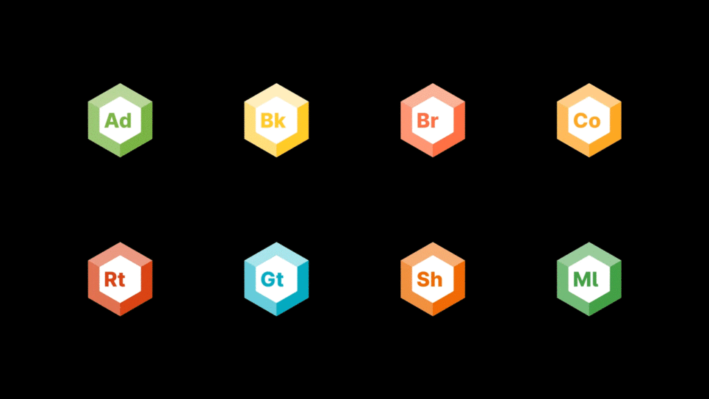
In addition to the new Icon, some minor font changes and the (thank you!) capitalization of Unity, they also made branding changes to their myriad of products:
As with all changes of this nature, reaction was mixed. If you are interested in learning more about Unity branding and the process behind them, check out the official branding page at https://brand.unity.com/. If you need to download the new logos, you can do so here.
Opinions are certainly split on the updates, leave your opinion in the comments on the video below on the new Unity logo.