One of the nicest features of Scene2D is the UI layer built over top of it. Scene2D.ui provides a series of widgets that make creating a UI an breeze, something often lacking in game development libraries. That said, there is one very confusing stumbling block before you can get to work with UI… Skins.
A skin is a collection of files that go together to make up your user interface.
First is a JSON file ( JavaScript Object Notation ), which is a popular JavaScript based data storage format, like XML light. In the JSON file you describe the various properties of your skin such as how your widgets should look.
Next is a texture atlas. We looked at using TexturePacker to make a texture atlas back in the graphics tutorial. The texture atlas describes the layout of all the images that make up your UI. This is a .atlas extension file.
Along with the texture atlas, you’ve also got the actual image that TexturePacker generated.
Finally you have the fnt and the associated image. We covered fonts back in the Hello World tutorial.
This can all seem pretty daunting, especially starting from scratch. Fortunately there is a skin included in the LibGDX tests. The files you are interested in are uiskin.atlas, uiskin.json, uiskin.png, default.png and default.fnt. Simply download and place each of these files in the Android assets/data folder of your project. If you are downloading from the Github link I provided, be sure to download the RAW version of each file!
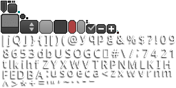
Let’s take a quick look at some of the above files for a better idea of what goes into them. I will ignore the font files, we already covered that. The atlas and png file we’ve already covered as well, but here is uiskin.png, so you’ve got some idea what is included:

These are the various graphics that go in to creating the UI. Let’s take a look at uiskin.json:
{
com.badlogic.gdx.graphics.g2d.BitmapFont: { default-font: { file: default.fnt } },
com.badlogic.gdx.graphics.Color: {
    green: { a: 1, b: 0, g: 1, r: 0 },
    white: { a: 1, b: 1, g: 1, r: 1 },
    red: { a: 1, b: 0, g: 0, r: 1 },
    black: { a: 1, b: 0, g: 0, r: 0 }
},
com.badlogic.gdx.scenes.scene2d.ui.Skin$TintedDrawable: {
    dialogDim: { name: white, color: { r: 0, g: 0, b: 0, a: 0.45 } }
},
com.badlogic.gdx.scenes.scene2d.ui.Button$ButtonStyle: {
    default: { down: default-round-down, up: default-round },
    toggle: { down: default-round-down, checked: default-round-down, up: default-round }
},
com.badlogic.gdx.scenes.scene2d.ui.TextButton$TextButtonStyle: {
    default: { down: default-round-down, up: default-round, font: default-font, fontColor: white },
    toggle: { down: default-round-down, up: default-round, checked: default-round-down, font: default-font, fontColor: white,
    downFontColor: red }
},
com.badlogic.gdx.scenes.scene2d.ui.ScrollPane$ScrollPaneStyle: {
    default: { vScroll: default-scroll, hScrollKnob: default-round-large, background: default-rect, hScroll: default-scroll,
    vScrollKnob: default-round-large }
},
com.badlogic.gdx.scenes.scene2d.ui.SelectBox$SelectBoxStyle: {
    default: {
        font: default-font, fontColor: white, background: default-select,
        scrollStyle: default,
        listStyle: { font: default-font, selection: default-select-selection }
    }
},
com.badlogic.gdx.scenes.scene2d.ui.SplitPane$SplitPaneStyle: {
    default-vertical: { handle: default-splitpane-vertical },
    default-horizontal: { handle: default-splitpane }
},
com.badlogic.gdx.scenes.scene2d.ui.Window$WindowStyle: {
    default: { titleFont: default-font, background: default-window, titleFontColor: white },
    dialog: { titleFont: default-font, background: default-window, titleFontColor: white, stageBackground: dialogDim }
},
com.badlogic.gdx.scenes.scene2d.ui.Slider$SliderStyle: {
    default-horizontal: { background: default-slider, knob: default-slider-knob }
},
com.badlogic.gdx.scenes.scene2d.ui.Label$LabelStyle: {
    default: { font: default-font, fontColor: white }
},
com.badlogic.gdx.scenes.scene2d.ui.TextField$TextFieldStyle: {
    default: { selection: selection, background: textfield, font: default-font, fontColor: white, cursor: cursor }
},
com.badlogic.gdx.scenes.scene2d.ui.CheckBox$CheckBoxStyle: {
    default: { checkboxOn: check-on, checkboxOff: check-off, font: default-font, fontColor: white }
},
com.badlogic.gdx.scenes.scene2d.ui.List$ListStyle: {
    default: { fontColorUnselected: white, selection: default-rect-pad, fontColorSelected: white, font: default-font }
},
com.badlogic.gdx.scenes.scene2d.ui.Touchpad$TouchpadStyle: {
    default: { background: default-pane, knob: default-round-large }
},
com.badlogic.gdx.scenes.scene2d.ui.Tree$TreeStyle: {
    default: { minus: tree-minus, plus: tree-plus, selection: default-select-selection }
}
}
If you’ve ever used CSS, this should look immediately familiar. You are essentially telling LibGDX how to style each class by using the fully qualified Java class name. Let’s take a look at a particular example we are going to be using shortly, TextButton.
com.badlogic.gdx.scenes.scene2d.ui.TextButton$TextButtonStyle: {
    default: { down: default-round-down, up: default-round, font: default-font, fontColor: white },
    toggle: { down: default-round-down, up: default-round, checked: default-round-down, font: default-font,
fontColor: white,
    downFontColor: red }
}
fontColor: white, downFontColor: red } }
You are setting the values for the class TextButtonStyle or on of the classes it is derived from. You may notice for fontColor, “white” is passed. If you look up in the skin, you can see how its defined:
com.badlogic.gdx.graphics.Color: {
    green: { a: 1, b: 0, g: 1, r: 0 },
    white: { a: 1, b: 1, g: 1, r: 1 },
    red: { a: 1, b: 0, g: 0, r: 1 },
    black: { a: 1, b: 0, g: 0, r: 0 }
}
You can see “white” is a Color with the values 1/1/1 for rgb and 1 for alpha… in other words, white
The other key thing is the value for down. As you can see from the TextButtonStyle, down is a Drawable. The value specified, default-round-down is an entry in the atlas file:
default-round-down
  rotate: false
  xy: 99, 29
  size: 12, 20
  split: 5, 5, 5, 4
  orig: 12, 20
  offset: 0, 0
  index: -1
This is specifying the size and location within the uiskin.png file. More details about skins can be found on the wiki.
Now that you have your skin files, let’s take a look at a sample using Scene2d.ui:
package com.gamefromscratch;

import com.badlogic.gdx.ApplicationListener;
import com.badlogic.gdx.Gdx;
import com.badlogic.gdx.graphics.GL10;
import com.badlogic.gdx.graphics.g2d.SpriteBatch;
import com.badlogic.gdx.scenes.scene2d.InputEvent;
import com.badlogic.gdx.scenes.scene2d.Stage;
import com.badlogic.gdx.scenes.scene2d.ui.Skin;
import com.badlogic.gdx.scenes.scene2d.ui.TextButton;
import com.badlogic.gdx.scenes.scene2d.utils.ClickListener;

public class UIDemo implements ApplicationListener {
    private SpriteBatch batch;
    private Skin skin;
    private Stage stage;

    @Override
    public void create() {
        batch = new SpriteBatch();
        skin = new Skin(Gdx.files.internal("data/uiskin.json"));
        stage = new Stage();

        final TextButton button = new TextButton("Click me", skin, "default");

        button.setWidth(200f);
        button.setHeight(20f);
        button.setPosition(Gdx.graphics.getWidth() /2 - 100f, Gdx.graphics.getHeight()/2 - 10f);

        button.addListener(new ClickListener(){
            @Override
            public void clicked(InputEvent event, float x, float y){
                button.setText("You clicked the button");
            }
        });

        stage.addActor(button);

        Gdx.input.setInputProcessor(stage);
    }

    @Override
    public void dispose() {
        batch.dispose();
    }

    @Override
    public void render() {
        Gdx.gl.glClearColor(1, 1, 1, 1);
        Gdx.gl.glClear(GL10.GL_COLOR_BUFFER_BIT);

        batch.begin();
        stage.draw();
        batch.end();
    }

    @Override
    public void resize(int width, int height) {
    }

    @Override
    public void pause() {
    }

    @Override
    public void resume() {
    }
}
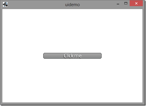
You run this app and you should see:

Most of this is pretty familiar at this point. We create a Skin object and load it using the typical file IO calls. The file you want to load is the json config, uiskin.json. This file points to all all of the other files, they will be loaded automatically by the Skin. Next we create a TextButton, the values passed in to the constructor are the text to display on the button, the skin and the value in the skin to use. If you look at the entry for the TextButton in the skin JSON file see:
com.badlogic.gdx.scenes.scene2d.ui.Button$ButtonStyle: {
    default: { down: default-round-down, up: default-round },
    toggle: { down: default-round-down, checked: default-round-down, up: default-round }
},
You are saying you want to use the “default” entry. Coincidentally, if you dont specify anything, default will be used. We position and size the button and set up a click listener that simply changes the displayed text when the button is clicked. Now the cool part… UI widgets like TextButton are simply Actors, so they work just like other Scene2D actors, add it to the stage and it’s ready to go.
Scene2D ui is a fairly involved topic so I will follow up with a more advanced example next tutorial.
